Step One.. Create A blog
Its my first week on HND Photography and our first task is to create a blog, MIND BLOWING. Not only have I never had my own blog I have never even read one before. Here goes...
Iv chosen to use this as I already had a google account, after all what is the point in giving yourself more work right?
While at work I decided to whip out my camera and begin, some of my best images are those haven't planned so I have started taking my Camera EVERYWERE. yes EVERYWHERE.
Today I am at Deep sea world and wasn't too sure how this would pan out given our first topic is colour, and I'm indoors and its dark... but decided to give it a bash anyway. Im so chuffed with what I captured...
For ALL 3 of the below images I had my DSLR on the same setting and I change my point of view, trying to maintain as sharp an image as possible, which wasn't easy trough the mirky glass in this place. Fish, fish food and such, waste....yuk. Settings where at 200-f5.5-1/30. The slower shutter speed needed for the low light but all these images are taken of living organisms which were moving with the water it was living in. A few attempts made and I am extremely happy how these turned out.
Use a limited colour palette to demonstrate contrast and harmonious colour schemes
Consider the relationship with other colours: complimentary / harmonious colour
Urban Nature
All my images have been captured in RAW then edited using Camera Raw and saved as a Jpeg as required. All my images have been saves as a 10x8. The camera settings on my camera are set to Adobe RGB which represents a wider use of colour space. If uploading onto the internet I usually save my images as appropriate to SRGB colour space.
SRGB- this is the most common colour space
JPeg- not as broad or wide a colour space, images tend to be parcialy edited when shooting in Jpeg therfore you dont have as much control when editing.
Adobe RGB- much more vast colour space- represents more colour and it is usually used in landscape photography
Refer to colour management for info
WORKFLOW
All my images have been captured in RAW
My works has been document from process from capture to output discussing decisions made in relation to colour management (colour spaces, colour profiles, file formats etc)
My Editing techniques have been used , demonstrating enhancement of colours etc, evidenced has been gathered using screen grabs with supporting bullet points of process added to your blog
Output: Images have been resized to 10x8 and saved ready for print: appropriate colour space and file format
.
Complimentary Colours
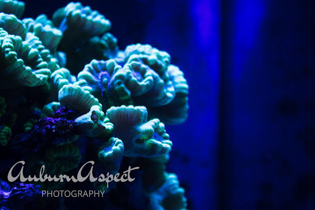
BLUES - This colour palette is amazing, all the different shade of blue are shown quite clearly here with a hint of some purple tones. The use of shadow and light compliment each other well and give a great sense of depth and texture even though it is quite dark. The POP of green where the light hits and the deep deep blue in the depths.

Light through the glass
This image was captures whilst at an art gallery , the sun was shining through the stain glass and reflecting onto the staircase below. These colour compliment each other very well, even though there are a vast range of colour they still all sit on the complimentary side of the colour wheel.
Although Contrasting this image of the bus is still Complimentary based on where they sit on the colour wheel. the main focus is of that on the red and blue of the buses and not so much of that of the natural green background of the grass and trees. When places beside each other these colours give great depth.
Same Location different Outcome
Wouldn't it be boring if we didn't all have a something a little bit different to add?
Both of these images where obviously not taken within the aquarium, the top one was outside at the seal attraction and the bottom was taken inside the main cafe. I find looking for colour is always difficult especially bright colour and those that contrast. Another theory on why I think the best images are unplanned.
Secondary Colours
I can't believe I remembered this... Secondary Colours. feels like a lifetime since I was mixing colour paint at school. I don't think I could have found more vibrant colours if I tried.
The life ring against the purple wall stood out for me, although I would have preferred the wall to be another colour(I'm not allowed to change it) I find this still works well. The rule of thirds perspective used here gives focus to the life ring will still making the contrast obvious. The realness of the floor and the pole in which the image was taken also gives a sense of realness. Nothing moved, nothing staged.
100-f11-1/60
Green Chairs... yes they are just green but the light and shadow in this image adds to the effect. Its giving depth to the image whilst still focusing on the fact that the are just green. The placement of the chairs against the table also gives this image a sense of realness. Filling the frame. You can tell the table has been sat round all facing the direction of the chair in the left of the image. This chair is pushed back whilst the others are close to the table. Maybe a child sat here. This image was not edited and only the size and format options for print where changed on here.
100-f14-1/60
How Did I GET HERE?
Well I like to do things my own way, doesn't mean cutting corners just my preference. I always upload my images straight on RAW. I then delete any images that are not usable before filtering trough my star system. I just find this is cleaner and it kills two birds with one stone and gets rid of any unwanted images on my memory card to save up space for all the wonderful images I'm about to take next time. After all, memory full is my biggest bug bare.
Once I have went through my star rating I then transfer my best images straight onto photoshop. if I am working outdoor I tend to use Lightroom but today I used trusty photoshop. I didn't find my images needed much enhancement. The aquarium images due to the low light and florescence only needed one or two spot healing techniques applied as did the secondary colour images as you can see below from the before and afters.
Filing. if I learnt anything from my HNC course last year it was to make sure your images are filed and headed as clear as possible. the amount of hours I spent looking through countless images to find a specific one through thousands was tiring and relentless and was not necessary if I had just filed them appropriately in the first place. Lesson learnt...
- Star Rating- I just mark for deletion the image i no longer like, i feel this frees up space
- File Management- as stated above. saving in appropriate folders and clearly headed
- Exposure and contrast lowered
- vibrances added for colour to pop
- saved under correct file size 10x8 for print
- Slight change in contrast applied
- saved under appropriate file size 10x8
- Contrast changed slightly, shadows increased to give focus to the colour
- file saves as appropriate size for print
- Only some Changes to below image
- Contrast change
- Exposure slightly darkened
- Images saves as appropriate file type and size


Comments
Post a Comment