Glass Image Change
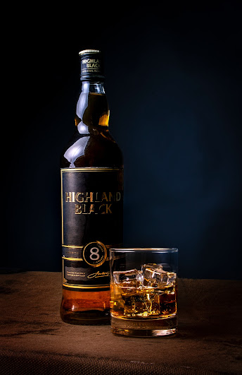
It was decided that i would change my glass image due to the fact that it wasn't my best work and there was a finger print on the finished item that ruined the whole look. I then decided to use an image of a Whisky bottle with a whiskey glass. Both of which are made of glass of course.
Camera settings 100-1/60-f5.4
I created this image in my home studio. I used a dark background and an old suitcase to rest my items on. In the whiskey glass i used coca-cola as i wanted the whiskey to remain full for the image. I then added some fake ice cubes to the glass for effect. Because of the light reflecting the label on the bottle i found it really difficult to get the writing all on focus as it was metallic. I did think about shooting the same image without any lighting on the bottle so i could re use the label but unfortunately i could not get the lighting right. I used one studio light for my image coming in at a 45 degree angle from the right hand side of the image. My composition having the larger item to the right and first followed by the whiskey glass slightly in front of the bottle but in the center of the image. I feel the colours work well and compliment each other, the dark blue hue of the background works well with the colour of the whiskey label and the whiskey itself as well as the suitcase it is sitting on. In my post production I used the mask tool the select the background and I slightly changed the saturation so that it looked more of a royal. I then slightly Vignette round the edges of the image to darken. I then saved the images as a 10x8inch and as a jpeg on my files with Niall ready to share.
Research
Image 1
The image was taken from Pinterest, the photographer is unknown but it captured my eye. It uses glass as its main focal point but incorporates colour. The composition is central with a reflective base for the wine glass. This with the reflection of the background inside the glass gives the image so much detail but in may different forms. The background itself probably created using a variety of lighting and print. the colours work well ranging from white to blue. I feel like one key would have been used coming from above given the shadow at the base of the glass although it is hard to tell as I feel this image has had a lot of post production and editing done after the initial image was taken. I would be keen to see the original image.
https://www.pinterest.co.uk/pin/pattern-distortions-seen-through-a-glass-of-water-still-life--816488607431988369/
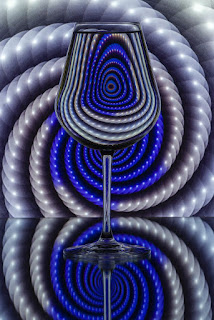
Image 2
Here are two standard ways to photograph glass, one is on a white back drop and another is on a white. I feel that using a white or black background are the only two effective ways in which to use when photographing a reflective item such as glass. This image in a black background with white reflective detailing. In order to do this the photographer described how they averred their work. He photographed against a Lightbox, to create the black details, he placed glass infront the the Lightbox with black blocking cars at either side. To create a black background with white details, he place the glass in front of the lightbox, but this time put black blocking card behind the glass leaving the light areas either side of the glass . I like the detail in the glass itself and how contrasting the reflective surface on the glass is in comparison to the black background.
My Image
I wanted to produce an image that wasn't just about glass and the egg timer was the key element, I wanted to create depth, reflection and I wanted to incorporate colour. Choosing an egg timer my intention was to show the falling sand but once I seen how well my image looked under the light I decided to focus my intention on the glass and colour itself. Using a dark backgrounds would give focus to my images. I chose to use a black backdrop with my egg timer glass image as well as a black reflective base surface to rest the egg timer on. I used two main light for my image with coloured acetate (red and blue). These were attached to my light using a metal clip. My lighting was controlled using a 90 degree angle on both directions one coming from the left one coming from the right. this would then create an even light through the glass and give different elements of blue and red to my image as well as even refection and shadow. You can see two finger prints on my image. This was deliberate. I wanted to create an element of realness and texture.
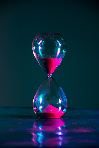
Camera settings 100-1/60-5f.6, Canon 2000d, 18-200mm lens, adobe RGB colour space
Post Production
- went through each image by giving star ratings
- selected those with best rating
- opened image via camera raw
- changed colour profile to modern x200
- decreased reds hue via colour mixer -100
- increased yellow hue x13
- deceased green hue -39
- increased aqua hue x53
- degreased blue hue -44
- increased purples hue+36
- increased magenta hue +52
- image then resized to 8x10 300ppi
- image saved as jpeg & p.shop file in appropriate folder


Comments
Post a Comment